Dec 5, 2012

More of Rebecca & Tim | Family

My goal with all my sessions is always to make images that people are proud to show off, that their family and friends "ooh and aah" over. It's especially satisfying when you are able to do it for your best friends. 

Becca and I have been friends since we meet in college. I had to switch schools to get my degree in photography, yet we have always remained close. And, I love that our youngest children are only one day apart in age.

Becca and Tim were visiting this summer when we did their family session. I love that I was able to photograph Becca's family. It means a lot when I can capture images for special friends that they love and adore.


Dec 4, 2012

The Reading Nook is Done!

 I had been searching online over a year ago for closet organizers when I came across a closet reading nook. It was a closet that had been turned into a cozy area for a child to hide away and read.

I fell in love with the idea. 

The closet that my middle two children share was driving me crazy. It was underused, and yet, it was always a mess. The idea of having a cute place to read sounded like a much better use of space. Plus, I knew the kids would use it for more than just reading.

It's an inside joke at our house that I come up with the ideas and Chris has to figure out how to make them happen. It's his own fault that I have complete faith in him- he always manages to pull through for me. He'll tell you the playhouse he built the kids in the backyard was really for me. (And maybe it was-- I'm waiting for the kids to be done with it so I can turn it into an adorable potting shed.) In the end, he always admits that they were great ideas.
For over a year, I asked Chris to redo the closet. He thought the idea was a little crazy at first. "Would the kids really use it, would they still have closet space, would it look out of place?" I assured him it would be cute and the kids would really use it. 

Finally, he gave in and went to work. And he came up with the perfect reading nook for the kids' room.


I wanted to keep part of the closet for it's traditional function of hanging clothes and storage. In the other part, I wanted a space big enough that a child could comfortable settle in to read. I also wanted it big enough that the space could double for playing. The design that Chris came up with was big enough to fit a parent and a child or two. Plus it included the book shelf, which was perfect for a place to set a cup of coffee when I'm reading to the kids.

The kids love it. My 12 year old is jealous and would love her own reading nook. I'd love to make her one, but alas, her closet is too small. She said she'd settle for a chair that hangs from the ceiling. I'll get Chris on that....

*Chris has detailed images of the Reading Nook in progress. If there is interest, I can have him detail it out.

Nov 29, 2012

Becca & Tim | Family

This is a quick peek- more to come!


Oct 24, 2012

Katrina & Nick | Family | Downtown Madison

 Busy is the best word to describe life with four kids. Katrina and Nick stay busy with four boys, all under the age of seven. Getting them all to sit still in one place was the last thing on any of the boys' minds. Luckily, we didn't need them to stay still for too long.


Oct 22, 2012

A Photographer's Child

We sometimes joke that we would like to invite strangers to dinner, just to get our children to behave through the whole meal.

It amazes people to find out that my kids don't always cooperate for photographs. It's true, they don't. It's because they know us.

We don't scare them.

As clients will attest, I have plenty of patience with children, waiting for them to be ready for photographs.

But photographers' children are different. They *know* the tricks. Don't let this image fool you. As we tried to get our soon-to-be 5 year old and soon-to-be 3 year old to stand still, while looking at the camera, they worked just as hard to wiggle and squirm away from us. When we asked for a smile, we got a grimace, when we asked for a pose, we got action.

We are scheduling a reshoot.

And this time, I'm bringing bribes.

Or a stranger.


Sep 24, 2012

Family Love | Katie & Brett | Downtown Madison

I absolutely love to have clients that come back year after year. Working with a family, seeing their children grow, is so fun for me because they feel like more than clients. They feel like friends. Katie and Brett are a perfect example. I have been photographing Sam since he was a baby. Plus, I love that we can get together and chat like old friends.

These photographs will show you that Sam is going to be a little heart-breaker! And check out Sam's shoes! Katie did an awesome job coordinating her family. The black, gray, and red were perfect together, with the red adding just the right amount of accent.  And again, check out those red shoes!


How cute is this face? I'm telling you, a total heart-breaker!

 I love the sky here!

Happy Anniversary to Brett & Katie!

Sep 21, 2012

Kera & Dan | Engaged!

Kera and Dan's big day is quickly approaching! For their engagement session in August, we headed to downtown Madison.

For most of their session, the weather was great. There was one small bump, though. I have to admit, I have never had to find shelter and wait out a freak rain storm in the middle of a session before. However, that is what happened to us that day. Kera and Dan were wonderful about the "delay" and the rain stopped just in time for some sunset images by the lake, complete with a rainbow in the background! I think that means good luck with their marriage.

Here are some images from their engagement session.


Sep 16, 2012

Cathy & Mike | Family Portraits | Madison, WI

I love being able to capture family portraits. And, when a family of 6 is as easy to work with as Cathy & Mike's was, it makes it a treat.

I worked with Cathy to fill the empty space in the entry area by her front door. For over two years, the nook had been empty, waiting for the right portrait to fill it. I custom designed a 33x38 canvas wrap that showcased her family to fit perfectly in that spot.

Now, the real reason to have your family portraits done is to show them off. So, to avoid any delay, we even hung her canvas for her when we delivered the order!


Aug 6, 2012

Pretty in Pink


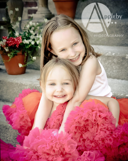
Yes, you can pull off having the family wear pink for your portrait session. Okay, Dad doesn't have to (he can wear something in an earth tone to coordinate with the khaki shorts), but pink is definitely a color that even teenage boys are wearing this season.

Just don't tell the boys they look "pretty."

Aug 1, 2012

Sarah & RJ | Wedding


Sarah and RJ had a beautiful day for their wedding. All the little extra touches made it memorable, like the family pin Sarah wore on her dress and the union chairs on their cake. Bucky Badger from UW Madison made an appearance and really livened up the dance floor with his dance moves!

Jul 19, 2012

Amanda & Jon | Wedding

Amanda and Jon's wedding took place in the Wisconsin Dells. The location is great for families that are traveling to the wedding destination. It's like a vacation built right into the weekend!

Jul 13, 2012

Kendra & John | Wedding

A few images from Kendra and John's wedding:

Jul 11, 2012

Too Much Of A Good Thing

You have your Pinterest account and you are following tons of people and accounts. How is that working?

Are you loving the ideas? Are they too much? Are you going to use any of them? Do you have this unstoppable desire to try to use them all?

So many ideas can become overwhelming. You need to know when to look at the pretty pictures and when to stop looking and start doing. No wedding will plan itself just by looking at the bridal eye-candy. These boards from our last post are meant for inspiration, but it's up to you to actually plan the wedding and follow through on all the details.

Remember that a couple of great ideas are all that you need to make your wedding fabulous.

You don't need to stress yourself out with trying to do everything that you see on blogs and Pinterest for your one day. Pick a couple that you feel are really fun or that would add special meaning on the day.

Then, forget the rest.

You want to be able to enjoy your family and friends on your wedding day, not stressing over the fact that you didn't finish your 64 DIY projects. Plus, some of the fun blog posts you see on wedding boards and sites are not even from real weddings, but from stylized photo shoots that were set-up just to show off cute ideas. The blogs know that you can't do everything on one day, so don't measure your real wedding by their pretend ones.

If you are looking for ways to use Pinterest better with your wedding planning, read this from mashable.com: How to Avoid Pinterest Wedding Angst

How do you use Pinterest? Is more better or can you have too much of a good thing? When do you draw the line in looking for new ideas?

Jun 26, 2012

All This Interest In Pinterest

Have you heard of Pinterest? If you have a bride planning a wedding, chances are you have. The online pinboard works like a chock-full magazine, flowing with a steady stream of new ideas that you can keep organized on a virtual bulletin board. This is the place to go when you are looking for inspiration for your wedding.

Whether you are looking for dresses, cakes or favors, Pinterest has images and ideas to help you create a gorgeous wedding. There is a search function that you can use to look for anything wedding. The best time to use Pinterest is when you are at the beginning of your engagement, at the start of your wedding planning. It's great to see what kind of ideas are out there to begin to organize in your head what you want to do with this big day.

To get started, we'd like to suggest some wedding accounts for you to follow:
Style Me Pretty
Wedding Chicks
The Perfect Palette
Martha Stewart Weddings
The Pretty Blog
Ruffled
Floret Cadet
Intimate Weddings
Brides
Bride Finds
Bride Finds From The Runway
The Knotty Bride
Bride and Joy, Vintage Wedding
Offbeat Bride
InStyle Magazine wedding hairstyles
Divinefrenzy, Invitations
Luxe Finds DIY wedding projects
Junebug Weddings
Southern Wedding Magazine
Lauren Grove, Every Last Detail
Vane Broussard, Brooklyn Bride
Postcards & Pretties, Wedding receptions

Do you have any favorites? Let me know if these Pinterest accounts are helpful or if you know of better ones. Where do you like to go for inspiration?

Jun 21, 2012

How To Mix in a Pattern

Figuring out the clothing for a family portrait session is the hardest part. It is harder than arranging the schedules to get everyone together, bringing the right bribes to the session, or deciding what size to order for the living room wall.

As you know, I like to recommend solids over busy prints and patterns for clothing. I love when a client will choose one color and select various shades within that color to best suit everyone in the family. Still, I am often asked if a pattern is okay for family portraits.

The easy answer is no.

When I say no to patterns, it's because it is too easy to do it wrong. I love a cute floral print as much as the next girl, and I know my daughters look great in a trendy print, but that's where the problem starts. It becomes a slippery slope of choosing what looks cute on each person, and then everyone has their own pattern. With nothing that matches, there is too much competing for attention in the photograph and the end result is just chaos.

But, you say, I've seen it done!

Well, yes. It can be done. Much like an interior decorator will select one "set piece," you can do that with your family's portrait wardrobe. The key is to choose only one. This takes much restraint. Also, it calls for the other items in the wardrobe to be in the same palette and simple in style. This approach often works better when 4 or more people will be in the photograph. I highly recommend staying away from patterns when there will be only two people in the photograph, such as an engagement session. That one person in the patterned outfit will become the focus, and generally you want everyone in the photograph to be equal.

How to mix a patterned piece within your family's portrait wardrobe:
-pick only ONE
-keep the pattern subtle, low contrast
-and use the colors in your palette, try to not introduce new colors